Why Unified User Experience?
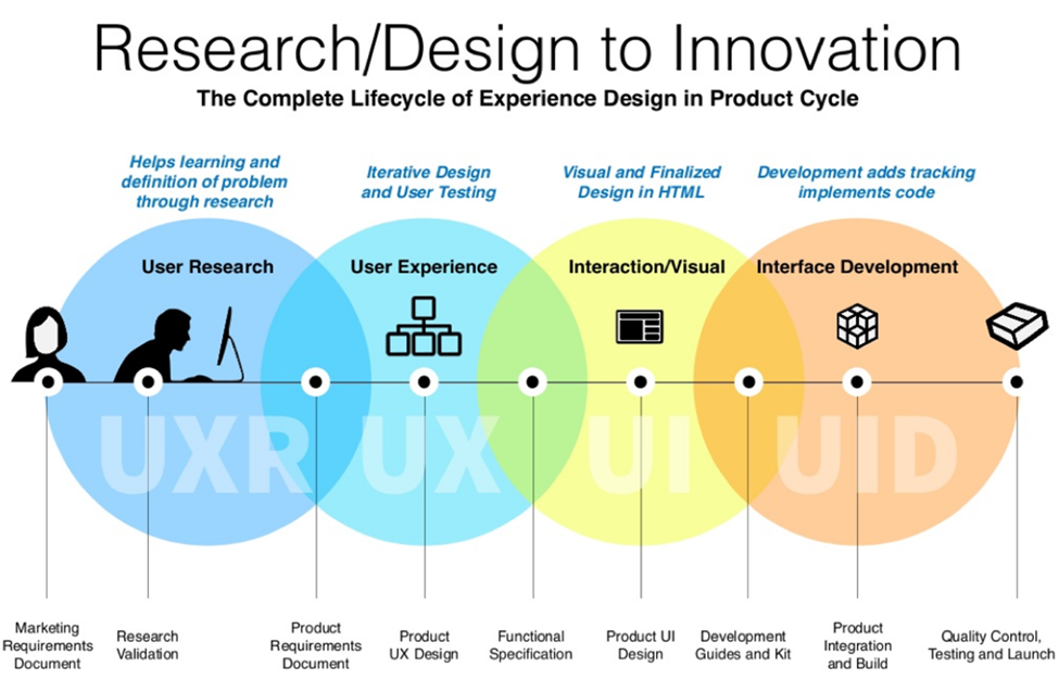
Unified User Experience Design (UXD) is an approach to designing user interfaces and interactions that aims to create a consistent and seamless experience across different platforms and devices. It involves integrating various elements, such as visual design, interaction design, and information architecture, to ensure a cohesive and intuitive user experience.
Our tale begins with a client’s ambitious vision—a desire for a seamless user journey that transcends individual platforms. Faced with the complexities of maintaining consistency across diverse applications, they sought the transformative touch of a UI library. Join us as we unravel the nuances of their vision, the challenges they envisioned overcoming, and the profound impact they aspired to make in the digital realm.
The goal of Unified UXD is to provide users with a consistent and familiar interface, regardless of the specific device or platform they are using. This means that users can easily navigate and interact with different applications or websites without having to learn new design patterns or user flows.
By adopting Unified UXD principles, organizations can improve user satisfaction, increase efficiency, and strengthen their brand identity. Consistency in design elements, such as color schemes, typography, and icons, helps users quickly recognize and associate with a brand or product. Additionally, a unified experience reduces user frustration and improves overall usability.
Good UX Design should be simple, usable, and visually appealing. Here are examples of products or services that have good UX Design:
Disney+ landing page: The Disney+ landing page is a great example of how to create a captivating and engaging first impression for users. The landing page features a full-screen video that showcases the variety and quality of content available on the streaming service. The video also changes depending on the user’s location, language, and device.
Visual-Design Principles in UX
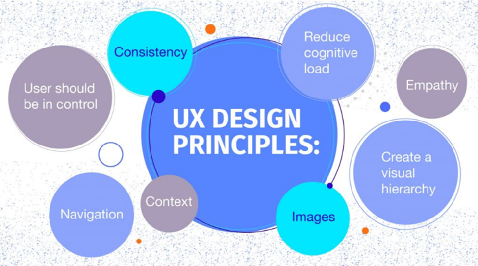
Visual design principles inform us how design elements go together to create well-rounded and thoughtful visuals. Graphics that take advantage of the principles of good visual design can drive engagement and increase usability.
1. SCALE The scale principle refers to using relative size to signal importance and rank in a composition.

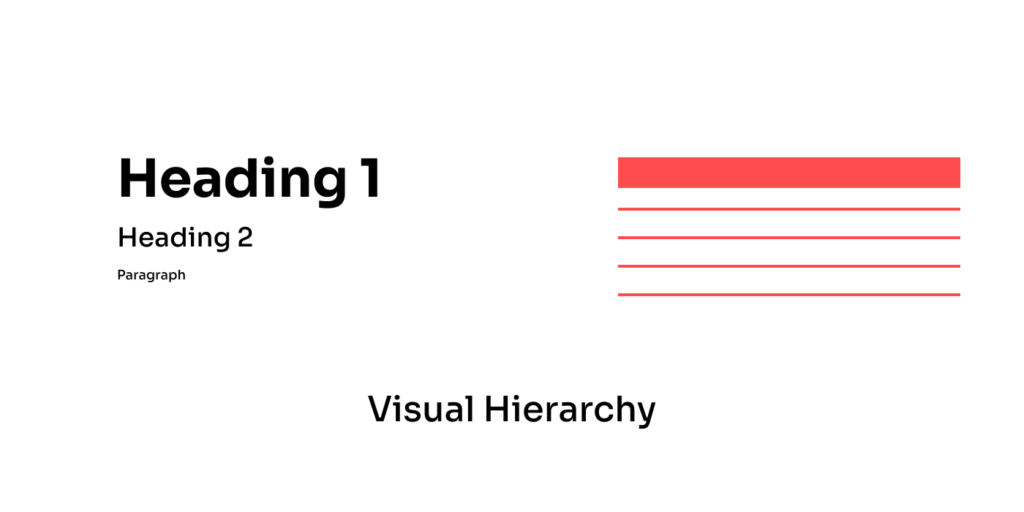
2. VISUAL HIERARCHY The principle of visual hierarchy refers to guiding the eye on the page so that it attends to design elements in the order of importance.
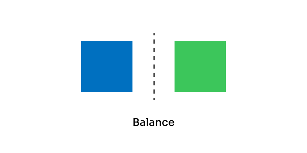
3. BALANCE Balance occurs when there is an equally distributed amount of visual signal on both sides of an imaginary axis.
example——–
Symmetrical:-
Elements are symmetrically distributed relative to the central imaginary axis

Asymmetrical:-
Elements are asymmetrically distributed relative to the central axis.

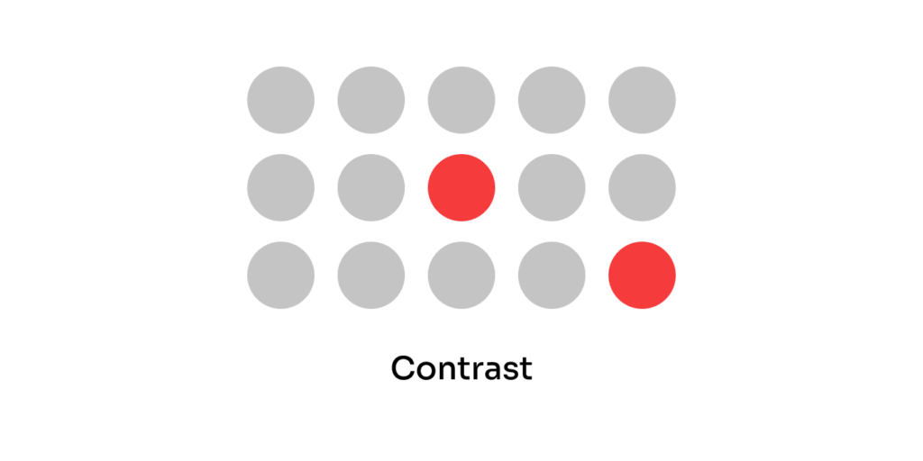
4. CONTRAST The principle of contrast refers to the juxtaposition of visually dissimilar elements to convey that these elements are different.
5. GESTALT PRINCIPLES Gestalt principles capture our tendency to perceive the whole as opposed to the individual elements.
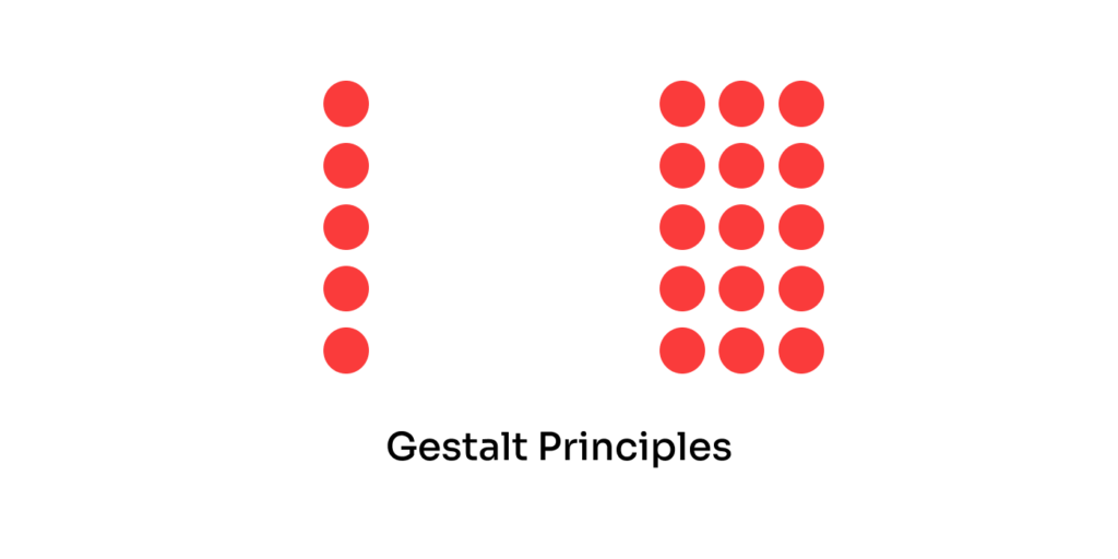
There are several Gestalt principles, including similarity, continuation, proximity, closure, and more.
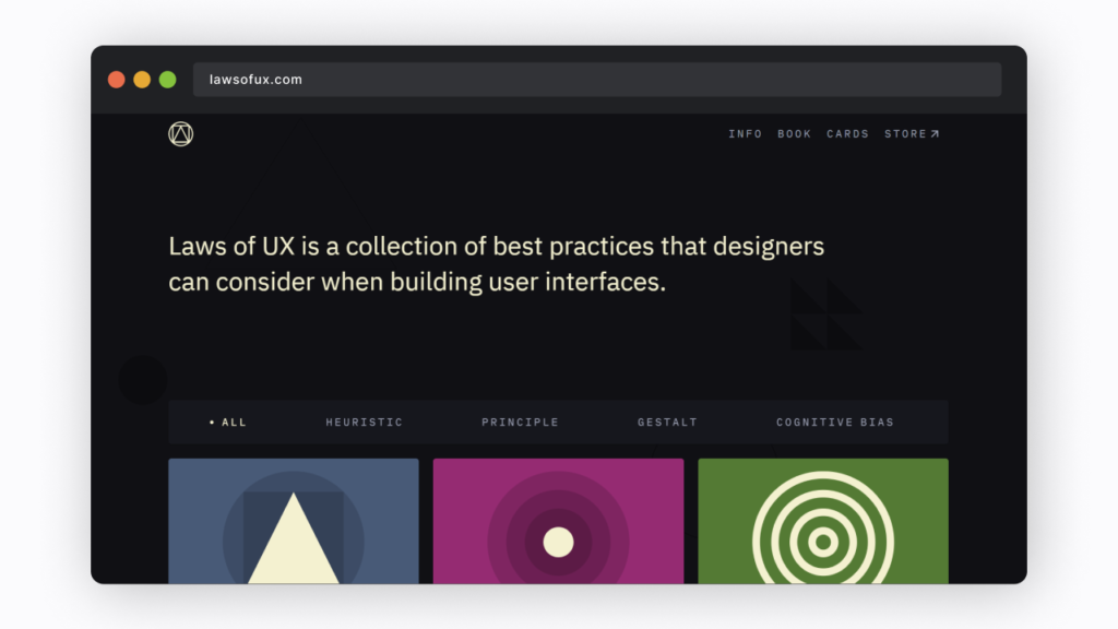
Learn more about these principles in the Laws of UX.
Purpose & Coverage of the field of UI & UX
| UX | UI |
|---|---|
| Competitor analysis | Understanding of UX design process and research |
| Customer analysis and user research | Customer analysis |
| Product structure and strategy | Customer analysis |
| Content development | Branding and graphic development |
| Prototyping and wireframing | User guides and storylines |
| Testing and iteration | Ul prototyping |
| Coordination with Ul designer(s) | Interactivity and animation |
| Coordination with developer(s) | Adaptation to all device screen sizes |
| Analysis and iteration | Implementation with a developer(s) |
Comparison of different aspects for UI & UX Designer
| UX Designer | UI Designer |
|---|---|
| The Thought Process goes into 1. Critical Thinking 2. Creative Thinking | Design is created based on 1. Client’s 2. Needs 3. Requirements |
| Design is created based on 1. User’s 2. Needs 3. Research | Design is created based on 1. Client’s 2. Needs 3. Requirements |
| They cover broader aspects around 1. Information Architect 2. Program Manager 3. Content Strategist 4. Functional Analyst | They cover broader aspects around 1. Graphic Designer 2. Brand Designer 3. Web Designer 4. Frontend Developer |
| Visual Strengths are heavily influencing 1. Task Flows 2. Scenarios | Visual Strengths are heavily influencing 1. Colors 2. Typography 4. Animation 5. themes |
| Expertise lies in the domains of 1. Wireframes 2. Prototypes 3. Research | Expertise 1. Mockups Ps 2. Graphics 3. Layouts |
Conclusion
To achieve a cohesive user experience, designers and developers should work together closely and adhere to established design guidelines and patterns. This involves using consistent visual styles, implementing standardized interaction patterns, and ensuring smooth transitions across various devices or platforms.
Unified User Experience Design is a holistic approach that prioritizes consistency and coherence in the design of user interfaces and interactions. By providing users with a unified experience, organizations can create a positive and memorable impression, while improving usability and user satisfaction.
Creating a UI library using Storybook, Rollup, Vite, TypeScript, and ESLint offers businesses numerous benefits, including improved UI consistency, development efficiency, code quality, and collaboration. Such libraries are essential for organizations delivering high-quality, maintainable software products.